Po' Smedley's Life And Brain Drippings
Putting It Together : Taskbars
Published on March 5, 2012 By PoSmedley In WindowBlinds Tutorials

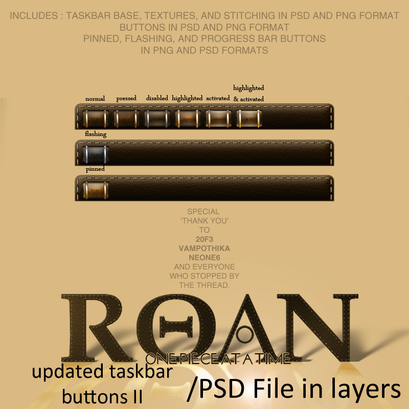
This thread will be dealing with the vertical and horizontal taskbar and all of it's components. I've had to do several redesigns to make the texture work and to accommodate the buttons. As far as the taskbars and buttons go, this should be the last (fingers crossed) redesign.

If you're looking for Part I, II, III, IV you can find them here:

One Piece At A Time : Windowblind Tutorial Part I

Design : Start Menu and Taskbar


One Piece At A Time : Windowblind Tutorial Part II

Design: Title Bars & Window Frames


One Piece At A Time : Windowblind Tutorial Part II

Design: Edit Controls


One Piece At A Time : Windowblind Tutorial Part IV

 Putting It Together : Start Menu


PLEASE :

  • I am open to suggestions but may not use any of them. Please, don't be offended if I don't use yours.
  • Keep the image posting to the skin(s)
  • If you want to make a skin to go with this, PM me for the files. My PSD's tend to be a mess, but I save everything and will be happy to     share. I am uploading the actual files to the Graphics Gallery here on Wincustomize.
  • We'll be skinning for Windows7, maybe Vista. If someone wants to do XP, PM me and I will get you what you need.
  • Any files you request will come as I complete them. I won't be jumping ahead. Please be patient.

-----------------------------------------------------------------------------------------------------------------------------------------

The PSD files for the  previous threads are in the Graphics Gallery.

Roan WB Title Bars and Window Frames  

  Roan WB Taskbar Buttons

ROAN WB Start Panel UPDATED

ROAN WB Start Panel Search Mode 

Roan Updated Taskbar and Buttons II


Comments (Page 1)
5 Pages1 2 3  Last
on Mar 05, 2012

Looking forward to the continuation. So far its very intriguing.

Back to lurking. lol

on Mar 05, 2012

There was an issue with the original design of the taskbar involving the texture not stretching or tiling without some kind of distortion somewhere in the applied piece. The solution was to do the taskbar in layers starting with a base, then two layers for the texture, and finally two more for the stitching (similar to what Tim did with the stitching in the Start Panel to allow for an even distribution of the stitches).

Open SKS and select the Roan Skin (if you're following along with the files) and select Edit Start Menu and Taskbars, then select Edit Horizontal Taskbars. Select Background and using the arrow next to 'Edit Image' import your Taskbar Base Layer. Be sure to check 'This image uses transparency' and that your image count is set to 2.


Now click on the Painting Tab and set your painting margins (see following image)


It's a good idea to select 'Save Skin' after you have your margins, etc., set. Click 'Apply Skin' if you would like to see what the taskbar looks like in the skin with just the base layer.

on Mar 05, 2012

Still on the 'Background' section of the Taskbar, select the Image Tab. We're going to add our first 'Additional Layer' to the taskbar background here. Nest to the 'Layer:' dropdown menu, slect the '+' symbol. The dropdown window should now say 'Additional Layer 1 (Taskbar.Horz)'. Using the arrow next to 'Edit Image', import the first taskbar texture layer. Make sure it is set to 'This image uses transparency' and that your image count is set to 2. (The image count for addtional layers should be the same as the base layer)


Now click on the Painting Tab and set your painting margins (see following image)


Click 'Save Skin".

Go back to the Image Tab and following the previous steps, we are going to add 'Addtional Layer 2 - (Taskbar.Horz)' and import the second taskbar texture layer.


Now click on the Painting Tab and set your painting margins (see following image)


*Click save skin.

on Mar 05, 2012

If you're following along and looking at your Taskbar right now, it probably looks like crap. That would be because I left something out. In photoshop, I made the texture layers and had to adjust the settings/effects so I could get the taskbar to look like I wanted it to and had it looking in my original draft as one layer. I then saved each layer as it's own png. When you apply them in SKS, you will have to set the 'Blend Mode' to what you had it set in Photoshop.

Still in Background, select 'Addtional Layer 1'. In the drop down menu next to the layer drop down menu, it will say 'Normal Blend Mode'. In this menu, you want to change it to 'Screen Blend with automask'. (see first image in post #3). This will not only allow the layer to be in the proper blend mode so we can achieve the look of the original design, but the 'automask' will make any bleed over transparent so that the layer is only visible on the base layer image.

Now, select 'Addtional Layer 2 ' and set the blend mode to 'Overlay Blend with automask'. (See image 3 in post #3).

Click 'Save Skin' and 'Apply Skin' to see the finished result.

This is not 'exactly' how it appears in the original draft. Part of this is due to having to do it in layers and that SKS does not have all of the blend modes that Photoshop has. (In Addtional Layer 2 I had the blend mode set to Soft Light in Photoshop. In SKS, Overlay was my closest option. It's a subtle difference in the finished image)

on Mar 05, 2012

Now , we are going to do the stitching layers for the taskbar. On the off chance that this will help anyone attempting anything similar OR help anyone who is following along to understand what we are doing here, I want to start by posting the png's we will be using for these next two layers. (Both are available in the Roan Taskbar and Button update II in the Graphics Gallery)

This first png is for the Horizontal Stitching that runs across the top of the taskbar. This is actually TWO images, one for the bottom taskbar and one for the top taskbar.


This second png is for the Vertical Stitching. Again, this one is actually two images, one for the top and one for the bottom taskbar.


I did it this way because I was unable to find a way to strecth or tile the stitching without some distortion. I got thew idea from what Tim came up with for the Start Panel.


on Mar 05, 2012

Man...this is gonna be awesome. How many steps altogether? I know there's quite a bit more to do.

on Mar 05, 2012

How many steps altogether?

I really have no idea. lol. My first blind and first tutorial. I'm trying to keep it simple but I'm kind of learning as I go along myself. After I get through this and try a skin on my own, I will try to do another tutorial that won't involve all the redesigning and stuff so it is easier to follow.

on Mar 05, 2012

Okay.

on Mar 05, 2012

Still in SKS>Edit Start Menu and Taskbars > Edit Horizontal Taskbars > Background....

Following the steps from #3, we are going to add another layer. This will be 'Additional Layer 3 - (Taskbar.Horz)'. Here we will import the first layer of stitching (Horz layer). Make sure you slect 'This image uses transparency' and your Image count is 2.


Select the Painting Tab and set your margins per the image below.


As Tim showed us in the Start Panel on the left and right dividers, we only need the one stitch and by tiling it, we can put it across the top of the taskbar without stretching or distorting it. Select your Extra Settings Tab and use the following settings. This controls how far from the edge of the parent layer the stitching for this layer will appear.


Go back to your Image Tab and create Addtional Layer 4 - (Taskbar.Horz) and import the second layer (vertical layer) of stitching and use the following settings.


Select the Painting Tab and apply the following settings.


Select your Extra Settings tab and apply the following settings.


Select Save Skin and Apply Skin.

If you are following along, you may notice an issue with the vertical stitching. If it is like mine, you may be seeing a 'half stitch' on the bottom of the left and right vertical stitching. This will (should, if you progress as I have) go away once we import the taskbar buttons and adjust the margins for text (which will adjust the taskbar height as well and allow for the stitching to tile evenly).

on Mar 05, 2012

Now we move on to the buttons. Before we import and apply them, I would like to go over a few things. Hopefully this will be of help to someone down the road. It will probably make the more experienced skinners cringe because of my description and method. If there is a better way, I hope they will jump in and explain it.

First, lets take a look at the buttons for Diamond.


Where you see orange, it is actually transparent in the skin. (I added the orange so you could see the actual size of the full png) The buttons are uniform and pretty basic. (Not to take away from anyone's work). Using Frame Builder or making a png with all six images is fairly easy when your buttons are minimal in design. Now look at the buttons for Roan.

The first thing you may notice is that the top and bottom margins are larger as well as the spacing between the images. Now, I want to post one more image before I try to explain what I did when importing these.


The above image is of three different drafts of the same button. Notice how they are centered (or not centered) in there areas.

There were several issues I faced after I did the drafts and then tried to import and apply them. It's something I have dealt with in previous attempts (because my designs are coming from a lack of experience with SKS) and I always seem to forget about.

  1. I forgot to take into consideration the stitching along the top of the taskbar. When I tried to apply buttons with no margins at the top and bottom, they would overlap and cover the stitching. I COULD have left it alone and gone this route, but in my head, I wanted the stitching to show. In image with the beige BG, I made the actual png size larger (55x52) and nudged the button down. When I imported it. the top stitching showed but the button was too far down AND it covered the stitching when I tried to use it in a TOP positioned tasbar.
  2. I nudged it up in the brown bg image but it still did not appear the way I wanted in the top taskbar.

Besides trying not to overlap the stitching, I ran into the issue of the icons for the buttons overlapping the gold rings. No matter what I did, I could not get them centered. IN Windows 7, the text margin settings are no help. After closer examination, I realized to have the icons centered correctly, or at least not overlapping the gold rings, I needed to adjust the button image and not just the position. This meant removing the shadows on the ends and nudging the rings a couple pixels towards the outer edges of the button. The result is the image with the orange background.

Then I imported it and just had to play with the paint and text margins until everything was centered. I had to go back to photoshop a few times as well and nudge the buttons around in the 52x55 background.

All of this was tedious (for me) and frustrating. It's the kind of thing (in the past) that has made me give up on a skin and threatened to beat me down again here with this one.

I guess what I want to say is that I believe there is a lot you can do with your designs. There is also a lot you just can't do. You won't know for sure until you try. (I was sure I would be giving up the stitching before I even started on this.) With the buttons, I had even started new designs. Before you let the frustration get to you, I strongly recommend just closing the skin and walking away for a day or two. In my case, I have a bad habit of insisting a square peg is going to fit in a round hole and will go blind trying to make it happen.

In the Roan Taskbar and Button Update II download, you will find the individual buttons in psd format (you can save into png yourself) as well as pngs for all of them, already assembled into one png. Applying the png that is assembled is pretty straight forward. If you want a taste of what I went through, you can try and recreate the buttons in individual images/frames and applying them that way. At the very least, it is interesting to see how much difference a nudge here or there can make the overall application of the images.

Before I go ahead and show how I applied the buttons...

If any of the more experienced skinners see mistakes or an easier way to do this, please post it the thread so everyone can see and I can curse you for the rest of the week.


on Mar 05, 2012

In SKS>Edit Start Menu and Taskbars > Edit Horizontal Taskbars >Taskbar Buttons>Buttons :

Select your Image Tab. Now, using the arrow next to the Edit Image box, you can import your buttons png with all the frames assembled. To use Frame Builder (as I did) select Frame Builder.

In Frame Builder, select 'Import Into All Frames' and import your 'Normal' state button. This will tell all the other states what the image size should be for each state. Now select 'Import into selected frame' and import the remaining frames/states accordingly.


Select 'Save with alpha channel' and make sure your frame count is set accordingly. Select 'Save file as'... and close the window. Be sure to have This image uses transparency selected in your Image Tab panel.

Select your Painting tab and set the margins as follows.

Select your Text tab and set the text margins as follows.


While in the Text tab settings, you want to apply your text colour. Select the text colour dropdown menu and here we will be using the same color we used in the Start Panel-Places. (I haven't decided on the text colour for each button state yet, but feel free to play around with them if you're following along in SKS)

Select Save Skin.


on Mar 05, 2012

Still in SKS>Edit Start Menu and Taskbars > Edit Horizontal Taskbars >Taskbar Buttons select Flashing Button:


This is only one frame/image. In the download, it is the same size as the regular buttons. You can import it and use the same Painting and text margins as shown in Post #11.

Now you can select the Pinned App button. This is two states/images. In it'as normal state, there is no image behind your pinned app. It will not appear until mouse over and changes on pressed. You can follow the steps in Post #11 using frame builder, or apply the assembled png containing both states by simply importing the image. Again, you can use the same Paint and text margins as in Post #11.

Finally, we have the Progress Bar buttons. This has six states/images like the regular taskbar buttons. These images are the exact same size as the regular buttons. Before you import and apply these, I would suggest applying the skin and run CCleaner to see how they work. You can watch as CCleaner scans for files. The Progress Bar in the sample blind you are skinning will look horrible on this skin and you will quickly see why they have to be the same size as your regular buttons.

You can import the progress bar the same way we did for the regular buttons in Post #11 and use the same Painting and text margins. For Roan, I followed the example from the sample skin and made each button identical. I do not know what options you have with the Progress Bar other than not using it at all. If anyone else does, let me know.

*I'm gonna take a break and when I come back today, I'll go over the other parts of the taskbar.

on Mar 05, 2012

PoSmedley
Now you can select the Pinned App button. This is two states/images. In it'as normal state, there is no image behind your pinned app. It will not appear until mouse over and changes on pressed.

If nothing is defined for this section, WB will borrow the image from the regular button (normal state) for the mouseover.

PoSmedley
Finally, we have the Progress Bar buttons. This has six states/images like the regular taskbar buttons. These images are the exact same size as the regular buttons. Before you import and apply these, I would suggest applying the skin and run CCleaner to see how they work. You can watch as CCleaner scans for files. The Progress Bar in the sample blind you are skinning will look horrible on this skin and you will quickly see why they have to be the same size as your regular buttons.

Same as with the pinned app button, if left unskinned (no image/settings defined), WB will use your flashing button for this section. In some cases you may like the look and not have to skin it.

on Mar 05, 2012

Lurking, and cheering you on!

This is not an easy skin to do, especially for a first one, and writing a tutorial as you go on top of that... You're doing great! 


on Mar 05, 2012

Lurking with encouragement.

5 Pages1 2 3  Last